JULIETA AGUINACO
Mexican painter Julieta Aguinaco (b. 1983) is interested in time, or, more specifically, the universal and constant change that occurs beyond the lifespan of humans. Her work draws great inspiration from the theoretical writings of French historian and sociologist Fernand Braudel, who classifies time into three categories: Biological, corresponding to the duration of a human life (in decades), Historical, in which one or more generations make history (in centuries,) and finally, Geological, the one in which mountains move, climates change, and evolution makes species transform (in millenniums). For Aguinaco, the painterly exploration of each type of time is of tantamount importance to her work. The paintings appear like stratospheric/geological cross-sections, often populated with minute imagery of contemporary society: industrial smokestacks and power-plants, traces of architecture, infrastructure, and even what appear to mimic primitive-like cave drawings. She states: “My context, in Mexico City, Mexico, its place in Earth, is now a threatened world: from the problems of climate change to the numerous political conflicts throughout the globe is chaotic and even frightening. I don’t mean to suggest a fatalistic view of the world, but these are complex times, and my paintings intend to portray the spirit of the moment within which we are living: the micro-universe of a local or personal history, to the macro-universe of Earth and its periods, when the idea of progress dies and the idea of fragility and catastrophe is born. To simply think about time, to try to understand it and to try to represent it, is my main sources of inspirations, and painting is a medium of infinite possibilities within its own restrained boundaries, and even such boundaries can be changed, broken, or trespassed.”
CHECHU ALAVA
There is something undeniably subtle and stirring in the works of Spanish artist Chechu Alava (b. 1973). Working out of Paris, Alava’s paintings elicit a quiet reflection on the nature of femininity and identity. After earning a BFA in painting from the University of Salamaca (Spain) in 1996, Alava delved into her artistic practice as a means of attaining a more intimate understanding of the value of beauty. With softened lines, a generally blurred appearance, and muted palette, her portraits take on the timeless feel of beloved old photographs lifted from literary, artistic, and even political histories. The paintings present their female subjects in traditional poses, reflecting an appreciation for art historical precedent. Accordingly, she finds inspiration in the work of masters such as Velázquez, Tintoretto, and Goya, but her variation of these predecessors is noticeable, even (if art may appear feminine) taking a feminist perspective that begs retelling. Perhaps the reflection on femininity within her paintings more tellingly recalls the work of Mary Cassat, another major influence on Alava’s practice, both of whom seem to focus on the domesticity and private, unremarkable moments of the female subjects they depict. However Alava does not defer to art history alone, and her selection of portrait subjects includes Ingrid Bergman, Simone de Beauvoir, Sylvia Plath and even Frida Kahlo…at age five. It is a tricky, perhaps pejorative task: to explore the mystery and austerity of beauty, a process that indeed prompts the viewer to reconsider the norms of representations of femininity. The viewer never doubts that Alava’s subjects are beautiful, but even as we appreciate their beauty, we are led to question the meaning and function of this aesthetic preconception with a sense of caution, as so many of her subjects meet our gaze, with a knowing, almost quiet defiance.
KRISTINA ALISAUSKAITE
The imagery of dreams is often understood as an uncontrolled cognitive reprocessing of the same images we encounter, even subconsciously in real life. And while for the most part, dreams and reality are considered mutually exclusive entities, Lithuanian artist Kristina Alisauskaite’s (b. 1984) attempts to question this theory through her painting practice. Executed in a palette usually restricted to black and white, Alisauskaite’s unsettling scenes typically remove many telling details, leaving ghostlike traces and mere suggestions of the images that are depicted. For Alisauskaite, such a presentation mirrors the atmospheric quality of dreams; which for her, allows complete unrestricted access to the psyche. Considered in this regard, it seems as though Alisauskaite’s paintings tell her what to explore, rather than the artist directing this herself. She references Freud and Jung in their theories of the subconscious, but maintains that her perspective is detached from psychoanalysis, and rather, aims to converse with the viewer through familiar, even banal scenes. Coded with symbols and metaphors, the works evoke an intimacy that seems uncertain, even private, inviting the viewer to quietly participate in the unsettling scenes depicted.
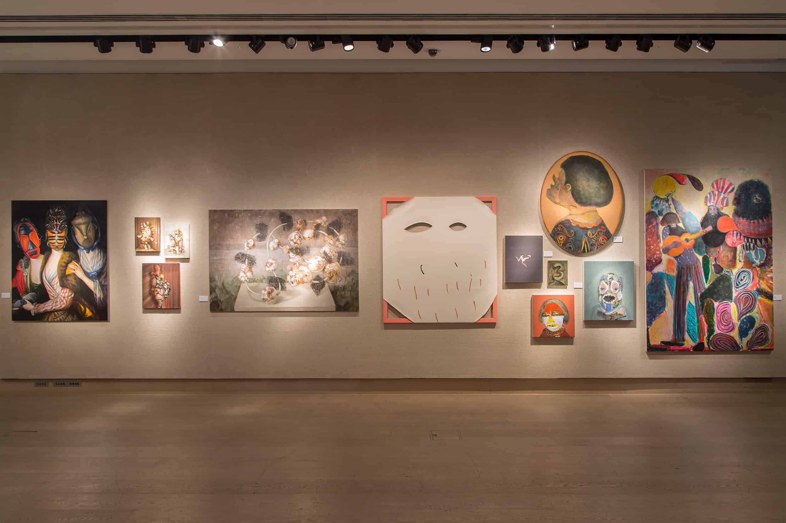
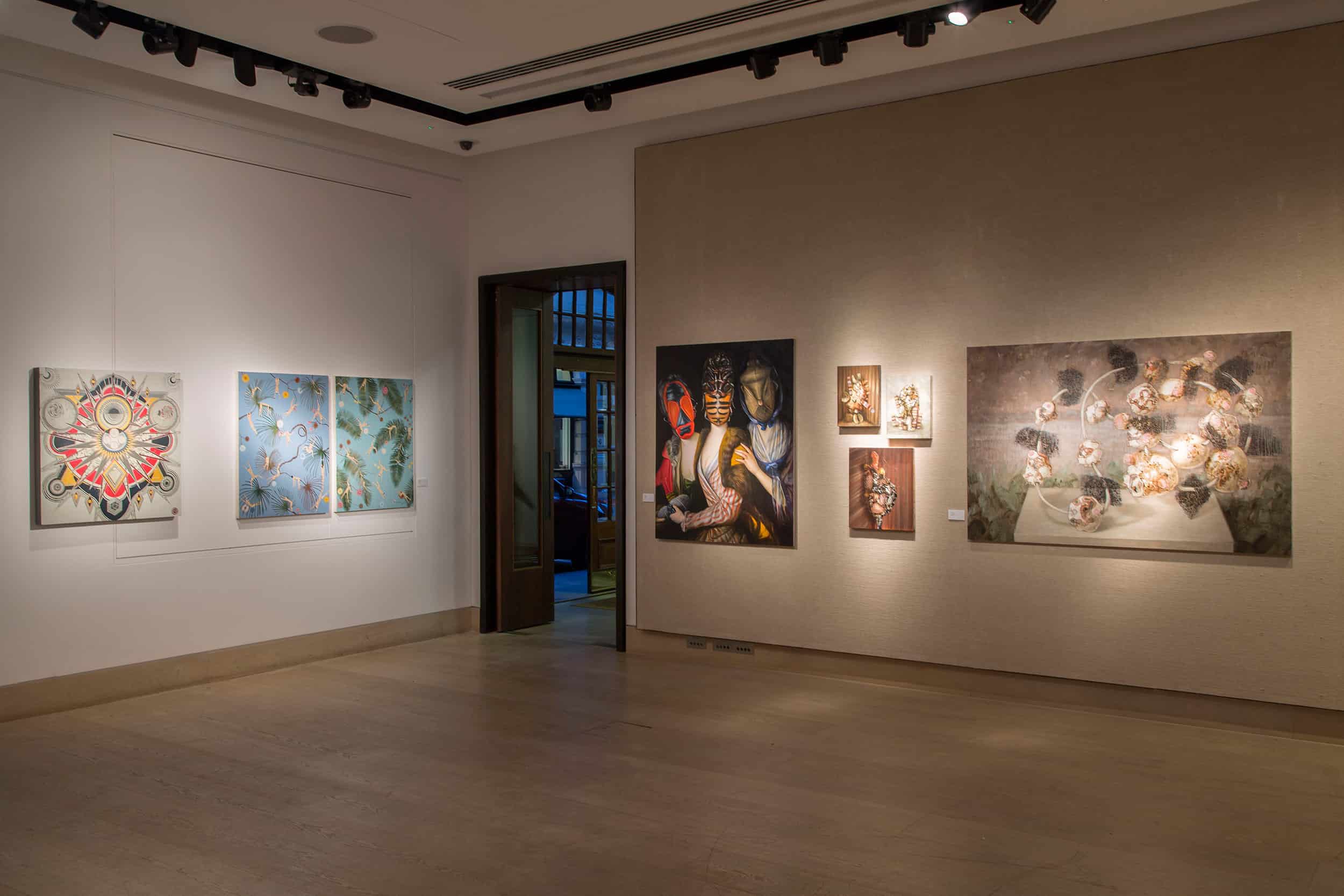
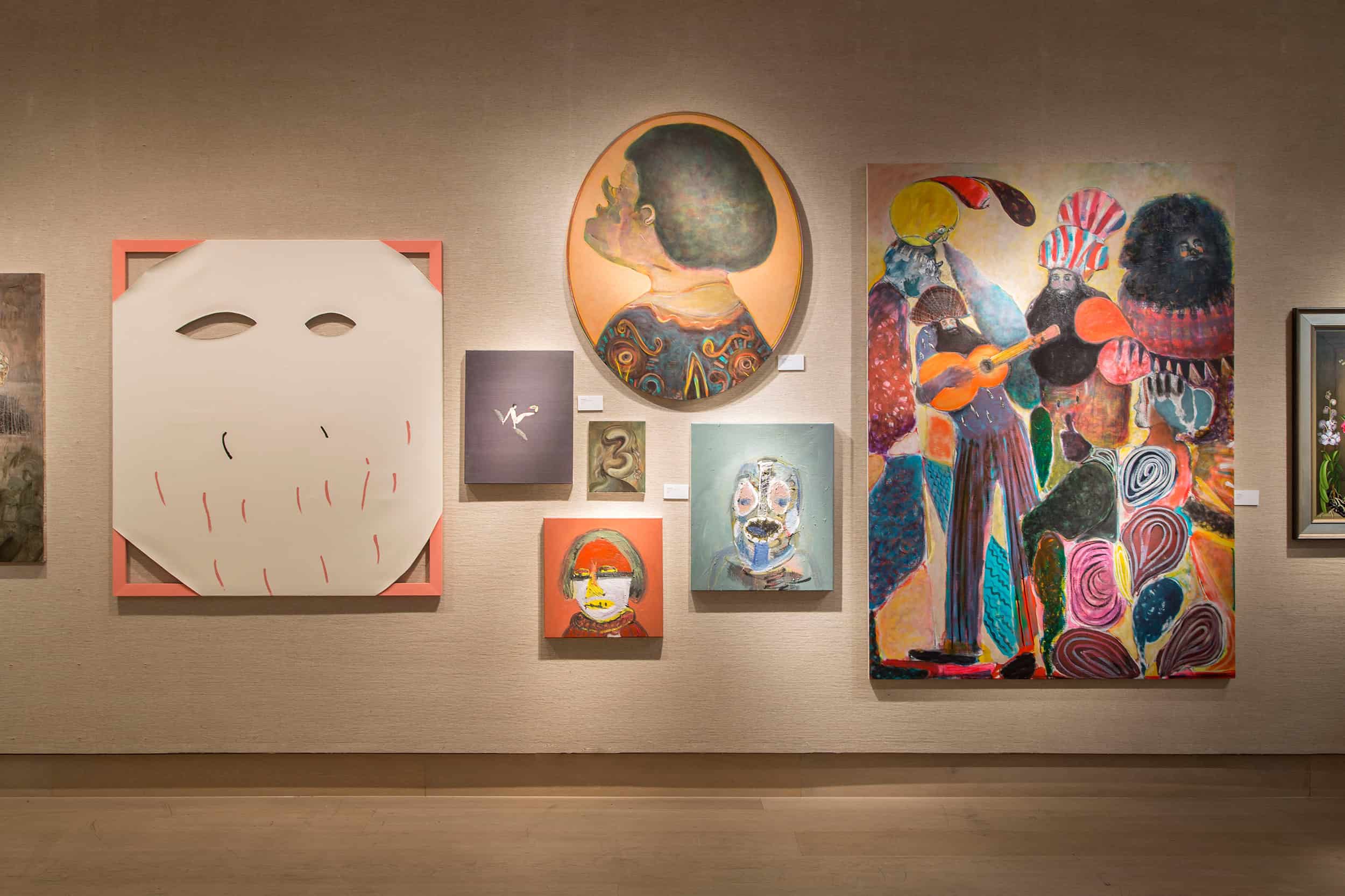
MICHAEL ARMITAGE
A 2010 postgraduate of the Royal Academy of Arts in London, Kenyan-born artist Michael Armitage’s (b. 1984) practice is concerned with East African development and its inevitable effects on traditions and culture. Notably, the works are painted on Lubogo Bark paper; taken from the Lubogo tree in its native Uganda, the paper is selectively known to be perhaps the earth’s most sustainable fabric. His series of paintings titled Peace Coma refers to the tensions surrounding Kenyan elections in March 2013, in which NGOs coined the phrase as a descriptor of the public’s unwillingness to criticize election results. Armitage uses painting as a method for reviewing images that question and reflect cultural and political development on both a local and international stage. “I have been thinking about the way that development is having an effect on culture in Kenya as older forms of cultural identity are threatened. What are we left with and how do we represent our selves?” Armitage lists the following example, where a ‘parody’ of the traditional of the Maasai hunting dance is performed for tourists or politicians. The ramifications of such parody on both culture and representation are significant on culture as they are on Armitage’s practice. He believes this simulacra is crucial to the understanding of his work, and also how ‘the tropics’ have been defined through the history of painting (he lists Gauguin, Kirchner, Rousseau, and Doig) and is keenly aware of his saccharine and nostalgically familiar palette of pinks, yellows, and cool greens accentuated by bright flashes of colour, a palette that seems remarkably familiar given the subject matter (and equally typical of those aforementioned artists). “Perhaps the way we look at these types of painted images has the same effect on the culture as does the Moran, continually performing his hunting dance for the tourists?”
CORNELIA BALTES
“My works are playful investigations,” says German artist Cornelia Baltes (b. 1978). Viewing the context of painting as one element in a wider arsenal of tools, she treats each components of her work as significant to the understanding of the whole composition. For instance, stretcher bars occasionally peek out from behind the hierarchical canvas, as seen in Dingbats. In Deep Thought, the notion of material hierarchy or even importance is further negated as Baltes cuts into the canvas to reveal the supporting wall. In doing so, she shifts the nature of the artwork and considers the painting as installation and an object within an environment. Similarly, in Girl with a Pearl Earring, the viewer is pulled into a greater art historical context to question the motive and source of the artwork, as well as its relationship to its current placement in space and time: less a painting, more an installation, or perhaps a conceptual artwork. Throughout her practice the idea of space is delineated to lesser or greater degrees, and a sense of context and humour seems to prevail in so doing. “I try to capture the essence of an idea, a simple beauty.” Baltes states. “I guess there is also an ironic nod towards heroic formalism in my work.” While she works in a number of different media, Baltes believes it is the directness of paint that trumps all others. It is perhaps this immediacy and historic context through which we unearth different meanings in her work, sometimes silly, sometimes thoughtful, but always responsible to the sheer tangibility of the object and the messages created therein.
AGLAE BASSENS
A duality exists in representational art between the object being represented, and its artistic interpretation; that is to say how an object appears, and how the artist chooses to depict that object are not necessarily one and the same. Belgian born, London based painter Aglae Bassens (b. 1986), chooses to situate her practice somewhere within this dichotomy, creating work that explores these corners of difference. She believes this duality is something inherent in the medium of painting itself, where the artist’s subjectivity and physicality inevitably alters each attempt with the medium. Perhaps it is for the purpose of unearthing these minute differences that her paintings feature so much repetition: rows of wigs in various colours, the legs of synchronized swimmers bent akimbo like folds of origami; the texture of water, or hair, embellishing a figure. However, perhaps Bassens’ approach to painting is less informed by her subject matter and more about her sheer love for the medium, as her process allows her to study the differences that occur, through repetition, in her very process of translating the medium from raw material to image. She believes it demonstrates the transformative power of paint, where an artist might more beyond a realm of the aesthetic to actually offer insight to the conceptual tendencies present within the actions of the artist herself, as evidenced through paint, and back again.
EMMA BENNETT
The presence of death is an unavoidable aspect of life, and for centuries artists have interacted with this sobering concept through their work. For British artist Emma Bennett (b. 1974), the act of painting presents the opportunity for a unique understanding of death and the effects of time. Educated at the Chelsea College of Art and Design (MA 2008) and currently based in London, Bennett’s paintings almost always follow the same method: still-life compositions set against deep black backdrops that appear both as painstaking homages to a tradition of still life while somehow managing to maintain a sense of urgent modernity. Drawing inspiration most notably from the 17th century Dutch Masters, Bennet also culls inspiration from a legacy of Baroque floral painters such Rachel Ruysch, and appropriates imagery from the Italian Renaissance and even from a diverse array sources more tellingly related to the technical mastery of her skill, such as photography and film. Yet despite their stark, cinematic qualities and hyperrealist appearance, Bennett’s works seem like off-center compositions of a more grandiose Classical story; as viewers, we are left to wonder what cropped from the frame, and what is suggested? Bennet’s medium of choice is telling in the sense that the very act of painting presents a temporal approach to creating art. Just like the still life tradition from which she quotes, both Bennett’s technique and the subject matter within the works themselves evoke the transience of time and fragility of life: wilting floral arrangements, dead hares strung up by their hind legs, transparent white cloths like funerary veils, even the whisper of a flame that seems to flicker before our eyes, all of which are archetypical examples of the memento mori. Perhaps the paintings still inspire because the fear of death still resonates with a contemporary audience, one connects to her desire to constantly question the permanence of the image, and of life itself.
GL BRIERLEY
Through an alchemic approach to painting, the works of British artist GL Brierley (b. 1962) seem to transcend logical classification. Her technique is rooted in exploration, where the end result is achieved through accident and chance. In one instance, we see what appears to be a depiction of coral reef, where the skins of pools of paint wrinkle and crease to create porous looking marine flora. The background ebbs and flows in and out of focus, taking on the appearance of a murky, sepia toned landscape, submerged and obscured. In another piece, an oddly humanoid figure looms before a trompe l’oeil background of a mint and white alternating zigzag motif. At one moment a grotesque clown face seems to appear, but in another the subject gives way to the sheer textural quality of the paint, where a mass of pink paint recalls melting ice cream. The entire painting is decorated with vibrant blue highlights placed carefully, as though icing through a pâtissier’s piping bag. It is precisely through the sheer sense of the uncanny, intimate, delectable, abject, and grotesque that Brierley’s works so elegantly combines. The paintings become at once entirely about their texture, their technique, and the application of paint, but one cannot move past these heaving masses: plant-like, organic, playful, horrific, looking like painterly representations of volcanic rock, chiffon, flora and fauna, or even human eyeballs, lips, and limbs. Peaking through their subtleties are the abject beauty, the materiality of flesh transcribed through the medium of oil paint, the limitless possibilities inherent in her chosen medium.
SZE YANG BOO
The abandoned shopping malls and uninhabited interiors of Sze Yang Boo’s (b. 1965) paintings are both haunting and culturally relevant. Inspired by the vast architectural structures found in Singapore, his home country, he transforms the space of the modern shopping mall into a symbol of contemporary living in an ongoing series of paintings that comes to vivid expressionist life through a loose and gestural technique, and a restrained palette to emphasize the materiality of the paint, but of the depicted subject matter. Boo often chooses to exaggerate certain architectural elements, causing things to warp ever so slightly, creating a type of optical play on representational accuracy, causing the viewer to alter the way we view familiar settings. Shopping malls, church interiors, circular rotundas, and empty commercial spaces with escalators that seem to stretch beyond comprehension, Boo’s paintings can be read as a heady critique of consumerism. The shopping mall in particular interests him as a subject since it is a building constructed solely for the purpose of economic gain, a topical critique given the prioritization of consumer culture in today’s society. So with such relevant commentary on society, why choose such historical weighted media? Deviating from accurate representation, Boo’s interiors appear almost as future fossils, a vision of a post-apocalyptic society on the verge of collapse. He considers painting to be a break from the excessively fast pace of modern life, and a necessary means of studying issues of the present. Whether he is predicting a future in which society no longer embraces consumerism, or offering a pessimistic metaphor for contemporary culture, the paintings are incontestably affecting.
JANE BUSTIN
Perhaps British artist Jane Bustin (b. 1964) considers herself a storyteller, composing bits of canvas, muslin, aluminum, wood, and various readymade objects in the desire to arrange and retell a story. At first, one may be struck by a challenge to comprehend the syntax she has presented for the viewer. In Masaccio, she references the 15th Century Italian ‘inventor’ of perspectival painting, perhaps as a criticism about the way in which we learn to understand images through any given notion of correctness. Her process involves long periods of research, during which she familiarizes herself with various historic and theoretical foundations. Writers such as Andrew Renton, Sally O’Reilly, Helene Cixous, Tracy Chevalier, and John Hull influence her conceptual framework. Bustin’s work focuses on the metaphysical value of painting. The act of visualizing philosophical concepts is of critical consideration, and in her paintings one senses a desire to elaborate on the broad function of the image. Still, the artist remains evasive with respect to how she reaches her conclusions through artwork, and how it is manifest in the presentation received by the viewer.
CARLA BUSUTTIL
Through her paintings, South-African born, UK based artist Carla Busuttil (b. 1982) searches for new ways to understand notions of historical authority and interpersonal and social conflict. Within the confines of the fictional world at war on display, the characters in her paintings are masked, lawless, lost, and lurching towards some undefined dystopian fate. The eeriness accentuated by stark, brightly coloured backgrounds in lemon yellow or cadmium orange. “The imagined world (or alternative present) is derived from history but extrapolated to an exaggerated end,” she states. Drawing from disparate historical contexts and referencing found images from history textbooks, newspapers, magazines, and the Internet, Busuttil presents the viewer with an adverse response to the age of consumerism and entitlement so prevalent of Generations X and Y. On closer inspection we can see how her paintings might appear to be political or religious iconography, mockingly repainted in garish colours and a primitive approach. “This is a universe of organizational redundancy, of Post-National Bliss” with masked characters that bare little resemblance visually to the originally sourced material and now inhabit a world of their own. Citing South African artists such as Robert Hodgins, Penny Sipis, Marlene Dumas and Kendell Geers as her greatest influences, what Busuttil ultimately questions through her constructed fictional realms is the illusion of exactness and truth, in both painting and in the representation of history itself.
BLAKE DANIELS
After witnessing the armed attack of a mother and her children on a train in Cape Town, Blake Daniels’ (b. 1990) paintings became concerned with exploring the politics of gender, race, family and society. Daniels, an American, was born in and raised in South Carolina and educated at The School of Art Institute of Chicago, Illinois; but it was during six months spent in Johannesburg that he linked personal experience to a fondness for art history and found his footing as an artist. His artwork is consistently critical of the prejudices of society. Los Caprichos, for instance, is based on Goya’s Capricho № 65: Dónde va mama?, the celebrated series by the Spanish artist in which almost all aspects of society come under scrutiny. Here, Daniels strikes with the same blade: “There became this turbulent atmosphere of mob violence [against the assailant on the train], and this idea of Capriccio Goya echoes strongly when I think of the illusionary morals, beauties and social conditions in both America and South Africa.” Born in 1990, Daniels is the youngest artist showcased here, but his cognizance toward real life models, and his painterly confidence, speaks beyond his years. At such an early stage, his style seems already clearly discernable. Through vivid coloration and partially figurative imagery removed from the confines of reality, Daniels weaves together narratives that are simultaneously relevant, historical, and imagined.
ADAM DIX
Executed in a series of glazes in a muted, monochromatic colour palette, the works of British artist Adam Dix (b. 1967) seem frozen in a timeless vacuum. They appear at once folkloric, almost like snapshots of a Nixonian era of home television, or scenes taken from the 1969 moon landing. Here we see a sepia-toned tableaux of individuals bowing down before oversized computer consoles. In The Hive, Dix presents us with a triptych of idol worship, cult-like adulation, and a vision of the future as though imagined through a 1950s lens. In The Advocates, a conformist society stands almost in worship of a curved wall peppered with satellite dishes. Dix states that the work concerns itself with the disconnect that occurs between communication technology and our desire to communicate. It is a study of how we comprehend technology on a humanistic level, and the isolation that technology can engender. By using themes of science fiction, popular culture, and religion, and by exploring ideas of ritual and ceremony, Dix emphasizes a sense of compliance toward technological worship; a secular celebration of communication, where the phone mast and satellite dish embody the ‘totem’ or religious relic. The connection to cult groups, 1950s and 1970s pop culture, and folk worship are evident, and the works are cognizant of their criticism of this Baudrillardian disconnect. It is at once a painted vision reminiscent of Kubrick’s 2001, or a context quotes as much from 1970 political anxiety cult films, like Logan’s Run and Newsroom as it does to 1950s lithographs or the naiveté inherent in primitive painting. Above all, the works seem critical of today’s society, using a multitude of appropriated imagery to comment on society at large.
DEJAN DUKIC
One can perhaps imagine a rather romantic idea: a stack of unfinished paintings in the studio of Austrian artist Dejan Dukic (b. 1975), lined up in a row so that only their canvas-covered, paint splattered shoulders are visible. Immersed in the reality of the work, the artist suddenly and inexplicably finds his ‘eureka moment’. In fact, the reality may not be that far off. Entitled Storage Paintings, these works are about the act of painting itself, where the traditional medium on two-dimensional support gives way to encompass practices that are sculptural, performative and as much about time, media, suggestion, as they are about the materiality that makes the sum of these parts. In such this direct approach, the notion of the painting as an object of value becomes externalized. A stack of monochromatically coloured paintings is as much about the act of painting as it is about our responsibility and expectations as viewers. It is here that Dukic’s work becomes experiential. In some regards, this is not unrelated to visiting the Mona Lisa in the Louvre, where immediately and excessively aware of our surroundings, we may catch a glimpse of Leonardo’s celebrated piece. But there is so little one can actually glean from this passing view, and so much is recalled about the context within which we learn to comprehend and understand paintings today.
ZHANG FAN
The intentionally discomfiting paintings of Chinese artist Fan Zhang (b. 1973) force the viewer into an uncomfortable state. His paintings employ a cast of characters who struggle simply to exist in their claustrophobic worlds. With green skin, missing noses, and tortured expressions, the figures seem otherworldly and out of place. Yet their bizarre appearance is a technique based in metaphor, for they are in fact representative of the reality of contemporary Chinese society. Zhang uses his work as a politicized criticism of his own culture, and an empathetic look at the individuals existing within it. Here, the stresses and agonies of everyday life are transformed into traumatic moments, and the people involved are similarly disfigured. But even as he inflicts pain upon his characters, Zhang explores the nature of reality with a combination of wit and seriousness. “These days there are a lot of problems, the situation is too complex, the reality is too cruel.” Zhang states. His paintings perhaps offer some alternate, sick display of reality, with a sickening smog within the air, humanoid monsters enrobed in straightjackets, eyes skyward in some perverse search of meaning.
MADELINE VON FOERSTER
Born in San Francisco, USA in 1973, Madeline von Foerster (b. 1973) relocated to Cologne, Germany in 2012. Today she is one of a handful of contemporary artists worldwide painting in the mixed technique of oil and egg tempera, developed by the masters of the Flemish Renaissance. Von Foerster is also eager to credit the School of Fontainebleau as a main source of inspiration. In terms of technical execution, she sketches the initial outlines of her works in great detail, often through extensive research, and a process that never includes projection or tracing. Yet despite their classical appearance and their seemingly antiquated technique and medium, upon closer inspection the paintings reveal their subversive, contemporary concerns. Fervently applicable to the present, von Foerster’s tableaux incorporates commentary on such topical issues as deforestation, wildlife trafficking, and human-caused extinctions. Ex Mare, for instance, includes a Chinese porcelain bowl containing a shark fin, offering commentary on the widely banned act of ‘shark finning’ for the Chinese delicacy shark fin soup. At the bottom of this altar, she includes a plastic bottle and a six-pack yoke, both of which have been greatly criticized for their harm upon marine wildlife. Von Foerster’s paintings take on the role of curio cabinets, showcasing an array of symbolic objects and items of conceptual intrigue.
MARC FREEMAN
The role of pure abstraction within the vernacular of contemporary painting is a subject that has been known to spark debates. Marc Freeman (b. 1979), an Australian artist working in Melbourne, finds such arguments both healthy and informative. Finding it relevant through “its ability to continually reinvent itself as a visual language.” His large scale paintings (typically around two meters in height) are layered, energetic, and often utilize mixed media to epitomize the spirit of abstraction and provide the viewer with a familiar yet distinctive iconography. They rely on both traditional and new materials, and contrast differing genres of painting in order to form a statement on the function of the abstract. Although not working solely with paint and canvas, Freeman employs an intentionally painterly approach in all aspects of his creative method. He regards painting as a primal source of our visual language, and an exercise in both the physical and the mental development of the artist. It is the immediacy of painting that allows Freeman to delve into abstraction, playfully joining this traditional medium with elements of contemporaneity.
NUNO GIL
Vaguely referencing mountains, clouds, and foliage, the paintings of Portuguese artist Nuno Gil (b. 1983) are inspired by organic forms and the natural world. An interest in the science of botany drives him to re-interpret biological imagery and apply it to the canvas, and what results is an abstracted landscape with a similarity to the decorative mixed-media paintings and buzzing landscapes imagined by artists such as Fred Tomaselli and Raqib Shaw. And similar to both his predecessors, Gil’s process is of tantamount importance to the understanding of his works. What appears to be inherent in the fabric of his design, where small reflective divots, are not only decorative, but double with a sheer perfunctory purpose: staples used to tack down pieces of painted and illustrated canvas into a greater collage. It is a process in which form and content are unified, where commentary on the proliferation of nature and humanity is executed in a process that favors hundreds, if not thousands of unique accumulating parts. For him, painting and collage itself is an organic action rooted in discovery, where intent and execution are rarely the same, and the worlds he imagines are confronted by the shortcomings of his media, his process and his technique. In this sense, Gil views painting as a means to come to terms with reality and a metaphor for his own insufficiencies and the shortcomings of humankind. Indeed, these works seem to suggest the bustling inconsistencies of our society, like an aerial view of a heaving mass of people, full of disruption, distractions, and intricate bits that interact to generate meaning.
PABLO GRISS
Through an amalgam of styles, and an approach toward abstraction that incorporates diverse media and styles, Pablo Griss (b. 1971) constructs an atmosphere of poetic interpretation through spatial juxtaposition. “I am obsessed with space,” the Venezuelan painter states, “a need to create atmospheres.” Embracing a style that incorporates both accomplished, geometric draftsmanship that sits alongside a loose and unconventional painterly approach, Griss’ strongly expressionist work weaves back and forth between angular lines and expressionistic, stream of consciousness mark-making. Through such stylistic freedom and a devotion to a layered, palimpsest-like approach, Griss lends a sense of visual depth to the works but also emphasizes the intangible, surreal nature of the backgrounds, both inviting the viewer into their environments while simultaneously reminding of their pure intangibility. At times, Griss’ approach is entirely reliant on geometric abstractions, other times, as though in a fit of expression, these same paintings embody wild organic movement. Undoubtedly, his strongest form of expression occurs when these regimented shapes begin to collapse upon themselves, suggesting so much more than mere patterning or abstraction. By exploring the materiality within his own practice, including collage, mixed media, and gold leaf, Griss seems eager to establish, and then deconstruct, his own sense of order both inside and outside the studio space.
KATE GROOBEY
Beginning in the 1950s, Edgar Degas commenced with what would develop into a recurrent motif. Alongside his paintings of ballet dancers, his nude bathers would become perhaps the most recognizable of his subject matter. Similarly, the works of Kate Groobey (b. 1979) seem like tongue-in-cheek references to Degas’ beloved nudes. Like crudely reimagined homages, Groobey’s paintings depict flanked, lifeless figures before skewed backgrounds in a variety of sea greens, cool turquoises, and sandy browns. One can see a relationship to other modernists, appearing like studies from Matisse’s dancers. While her recent work discards the figure in favour of plant or machine-based subject matter, the continuity from the earlier figures is evident: quickness of brushwork, broken lines and what appears to be a frantic painting pace. Painting from her North London studio, Groobey works from small sketches and watercolours, which then become transposed onto larger scale canvases that she paints directly on the floor, working with immediacy and intuition. “I work fast, recreating the immediacy of the initial drawings. I tend to work in series. At a particular time there will be a vocabulary of motifs or images that circulate or get cut up and re-arranged so that the paintings talk to each other. Figures disintegrate into gestures, but each mark has to count, to have a purpose. It’s very physical. It’s dirty. There’s no back button. You can’t save a previous version, and that makes it exciting.”
ANDRE HEMER
New Zealand born, Sydney-based painter Andre Hemer (b. 1981) is quick to list the sources that inform his paintings, with titles like Swag, Smushing, and Nicki Minaj or Diamonds and Swimming Pools. They seem imminently topical, oozing from a zeitgeist of graffiti, Photoshop, and even a sense of Aussie surfboard cool. “Painting in its simplest form captures the aesthetic collateral from a moment in time,” he states. “It’s a democratic form of expression because it simply requires looking. ” And Hemer’s work is aware of its contemporary context; he doesn’t try to hide their superficiality, their prioritization of surface, shine, and optical stimuli, creating a connection between videogame, computer screen, and studio floor: “Colour gradations, vector scrawls, spray tools, tessellated screensavers, painted gestures, and digital glitches are layered, composed, entangled, and erased, embracing the possibility, beauty, and failure of the slippage between digital and object-hood.” Visually, the paintings are reduced; despite their neon colour schemes and frontal compositions, they revert back to a confidence in communication through a series of familiar visual cues. “I am a child of the Nintendo generation. I have grown up in a generation that had its way of interfacing with the visual world completely altered by the screen and virtualization. Images are flat, back-lit, and fast moving.” Yet the paintings maintain a critical distance, appearing detached from this way of looking, without becoming too senselessly graphic. “When else in history could a painting be informed simultaneously by both Cy Twombly and the Apple homepage?”.
AKIRA IKEZOE
Food, sleep, sex: Some of our most fundamental human needs and desires. Though the gloss of civilization has tempered our animalistic urges, they still lie within us undamaged. In the work of Brooklyn-based Japanese artist Akira Ikezoe (b. 1979), the questionable authority of civilization is constantly challenged; War at the Zoo, or The Olympics seem to glorify the decadence of society, violence, and the carnal urges of humanity. Filled to all edges with an abundance of visual information, his paintings depict the human condition with irony and humour, balanced between scenes that are situated somewhere in a time-lapsed version of reality. In The Way to and from School, nude figures are dispersed in a naturalistic idyll, while one figure stands atop an oversized iPhone. He describes these paintings, and art in general, as an umbilical cord between the animalistic forces of nature and our longstanding attempt to civilize and form clearly delineated social structures: a struggle to understand our evolving place in the universe.
EWA JUSZKIEWICZ
In the history of art, stereotypical representations of women are discouragingly predominant. Born in 1984 in Gdansk, Poland, Ewa Juszkiewicz is skeptical of these representations. In her recent work, she eagerly discards canonical depictions of beauty that conform to “the feminine ideal”. While traditional in terms of technique and execution, her paintings challenge the conventions of female representation through whimsical elements used to conceal the subjects’ faces. Although posed formally and dressed in historical clothing, the portraits’ traditional appearance is negated by the inclusion of obscuring forms and objects. It is in this way that Juszkiewicz views these works as acts of transgression, perhaps even rebellion, against an art historical context that is rife with antiquated gender norms. By adding elements of the fantastical or cultural elements (like a recurrent decontextualized totem pole mask), the works dance on the edge of parody, light-heartedly poking fun at the social expectations of the past. Although she recognizes that painting is perhaps a medium rooted in the past, Juszkiewicz believes that it is easily applicable to issues of contemporary society. Within her work, paint is an effective transmitter of social and political messages. Juszkiewicz trained at the Academy of Fine Arts in Krakow and today lives and works in Warsaw, Poland.
JAMES KUDO
In 1990, artist James Kudo’s (b. 1967) hometown in Brazil was destroyed by floodwaters. Overwhelmed by the destruction of this familiar landscape, Kudo turned to his artwork to communicate the complexity of the loss. His paintings are based on the transience of memory, and the overarching theme of transformation. Just as the flood submerged his town, Kudo maintains that memories are inevitably submerged in the tides of passing time. Strange, given this consideration that his paintings often seem to depict architectural debris afloat in time and space, as though suspended in water just above the surface of the painting. For Kudo, painting presents an opportunity to recover and make permanent such fleeting memories and moments, where these overlapping elements seem to constitute the fragments of memory that can so easily slip through the cracks, almost intangible or forgotten. Yet there is always the question of the accuracy of these painted recollections. Subjectivity and fiction play a role in Kudo’s work, and he consistently implies the fiction of memory itself. Painting allows him to record, however subjectively, the elusive memories of his childhood. For Kudo, the act of painting has thereby come to represent a reclaimed version of the past for himself and the viewer.
LAEL MARSHALL
For American artist Lael Marshall (b. 1968), art begins with interaction and manipulation. Her paintings are executed on utilitarian fabrics such as dishtowels and handkerchiefs, and she enjoys stretching the relationship between paint and pre-existing patterns. In fact, Marshall is not simply supplanting abstraction upon her materials, but rather finds herself most commonly drawing inspiration from these source materials. She finds beauty in the textural qualities of cloth, and uses its unaltered physicality as a base when painting on it. The natural, unplanned tendency of fabric materials to pull and twist in response to paint is something that Marshall both appreciates and embraces. She enjoys the stubbornness of found objects, and the often-surprising ways in which the application of paint affects the finalized artwork. Even when her works do not include the use of paint, Marshall still considers her approach to be painterly, full of discovery and exploration. All of her objects, painted or otherwise, are crafted as a tribute to the transformative power of the artist.
TONJE MOE
The dichotomies inherent in painting can sometimes present a visual or conceptual challenge for artists upon which an entire practice can find its purpose. For Tonje Moe Pettersen of Norway (b. 1978), such duality forms the basis of her artistic pursuit. She considers it her mission to strike balance between mess and the order, harshness and the harmony, truth and fabrication. Further accentuating this, her paintings have a hallucinatory quality that causes the viewer to oscillate between foreground and background, reality and dream, architecture and nature. Geometric forms are placed within an indefinable space and thus isolated from a sense of representational authenticity. Inspired by the transcendent power of the natural world, Pettersen incorporates abstracted organic imagery into her work, often confined within the borders of a geometric object. Her simultaneous appreciation for architectural geometry and organic fluidity manifests itself clearly in the finished paintings. It is by juxtaposing seemingly opposite visual identities that her work takes on a complex and multi-layered meaning. She states: “I do organic paint-scapes with references to vegetation, earth, sky and fjords. I paint fast, spontaneously, and I am endlessly thrilled by colours. Painterly mess pleases me, yet I appreciate structure and patterns. When I paint, I find myself constantly balancing the messy and the orderly, the harsh and the harmonious. I love to make a painting breathe, to create bits that move in and out, surfaces where something is growing one second and shrinking the next, areas oscillating between foreground and background. The painting comes alive, not unlike a hallucination.”
GUILLERMO MORA
As a medium, paint can perhaps be considered a form of manipulation of the surface or object it is applied to. Spanish painter Guillermo Mora (b. 1980) appreciates this aspect of the art form. His work creates painted sculptural objects that manipulate the function of painting as we have come to understand it thus far. Removing the idea of painting from its canonical dependence on the framed canvas, he uses oddly cultivated objects as his painterly base: these are paintings that remind us of a rucksack, a rolled carpet, or a collapsing ceiling. Mora is interested in the way we attempt to compact and compartmentalize our lives, always squeezing as much information as we can into the smallest space possible. He finds that his sculptural process actually allows him to expand on this idea, as its materiality and application lends itself to the process of construction. In Entre tu y yo, 200 meters of stretcher bars, painted in hot pink, dangle from the ceiling in what appears to be a reverberating commentary on our relationship to the work of art within a space. As layers of paint build and transform the surface of an object, or those fabrics that compose an artwork itself, the object becomes hidden in both literal and metaphorical ways. In this way, Mora sees paint as a chance at a second life for his objects wherein which they are transformed from their otherwise decorative or superfluous former lives.
RYAN MOSLEY
The works of Ryan Mosley (b. 1980) tell a narrative rooted in folklore, fantasy, and the macabre. In Dance of the Nobleman, the viewer is confronted with a painting as though framed within a stage itself. A group of onlookers in silhouette line the bottom of the canvas and witness the curious spectacle of a figure, clothed in black, dancing alongside a skeleton and a series of seemingly floating skulls. The entire piece glows from an unearthly neon orange under–painting, something that has become typical of Mosley’s work, as though the story has evolved from where it first began. In this way he suggests further layers of meaning beneath the chosen vignette. His is a powerful language, one of recurrent figures such as lonesome farmers, bearded noblemen and gentlemen in top hats. The setting is performative, even silly, but is belied by a sense of claustrophobia and nightmare. Mosley states that the setting of the stage frees the paintings even further from the rational, and creates a space where ambiguous narratives and anthropomorphic objects swirl and intoxicate. There appears a sense of sadness, too, in the futile pursuits of the often-solitary protagonist. “It’s uplifting,” he says, but follows with “it’s depressing and tormenting equally.” And as viewers, we are privy to this paradox through the limited portals that Mosley has offered to us. Are they magically realistic? Fantastical? Folkloric? It seems that Mosley’s narratives incorporate each in full measure. To what extent he has based these scenarios in reality is ambiguous, but perhaps this is the accomplishment of these works, since we as viewers find ourselves incalculably pressed to dig further into the world he has created.
KINGA NOWAK
Kinga Nowak (b. 1977) is a painter for whom the subconscious spirit is the greatest source of inspiration for her artistic practice. Forgotten memories from her childhood are revisited decades later, and inform her work on a subliminal level. African motifs in her work originate from early exposure to an African art museum in her youth, a connection that only occurred to her years later in her adult life. Incorporating these elements symbolizes the juxtaposition of past and present, a recurring theme in Nowak’s work. Her paintings, a mixture of figurative scenarios, seemingly out of context and set within flattened, almost cartoonish landscapes, aim to express the ambiguity of emotions and relationships, as well as the fragile link between memory and the self. Viewing paint as a medium that allows for the crossing of boundaries between that which is literal, spiritual, and intellectual, Nowak crafts each painting as a puzzle, attempting to inject a feeling of narrative or metaphor to the viewer on a subconscious level, believing that only through is she able to reach into the past and solidify these messages and memories as something less ephemeral.
SIKELELA OWEN
For British artist Sikelela Owen (b. 1984), the medium of painting presents a unique opportunity to deepen personal relationships. Through the act of painting she challenges herself to obtain a greater understanding of the individuals whose lives intersect or have impacted her own, both historically and in the present day. Referencing early modern portraiture of the 19th century, Owen’s works have the intimate atmosphere of a quiet conversation with a close friend. She embraces this familiarity with her subjects through what she considers to be the immediacy of painting—a characteristic that allows her to close the gap between the painter and the represented object or person. Although her portraits are largely based on friends and family, they maintain a universal relevance that alludes to issues of race, class, and representation. Owen works with a consideration of the loaded historical connotations associated with painting, and her appreciation for the past helps to inform the intimate nature of her portraits.
EMILY PLATZER
Painting can often act as a mask, subverting the reality of an object or situation. British painter Emily Platzer (b. 1989) draws on this notion to create a painterly metaphor of human insecurities and emotions. Platzer’s work presents spaces that are true to neither life nor memory, and in this sense they represent non-existence, a fundamental phobia of humanity, where one struggles to find meaning distinct from any basis in reality. As a result, her paintings maintain a certain psychoanalytic qualities of the unconscious, the repressed, as though the works articulate hidden human fears and desires in lieu of any actual desire to record truth. In Dog, for instance, the canine in question is reduced to a freakish amorphous blob atop a lain brick floor tilting upward, our reaction to this uncanny spectacle one of unnerving removal. For Platzer, the exploration in paint allows for a useful means of expressing the subtleties of internal conflict made visible.
ANNA RING
Swedish artist Anna Ring (b. 1979) takes a distinctly unconventional approach to painting. Using organic materials such as chocolate, algae, and fruit, she paints site-specific forms directly onto the walls and floors of galleries. Preferring to emphasize the materiality of these substances over any overarching conceptual idea, Ring’s paintings consist of reduced, simplistic geometric shapes. The size and placement of the work is determined entirely by its relationship to the nature of the exhibition space, and Ring’s relationship to her surroundings. At times, Ring incorporates architectural elements of the room into her installations to further our understanding of medium and space, as though commenting on the transience of the work and our site-specific relationship to not only the work in question, but to our temporal, sensory-based comprehension of existence. The organic nature of her materials means that the works can only be preserved through photographic documentation, but Ring embraces this as the inevitable course of the artwork’s lifespan. Indeed, the eventual destruction of each work is critical to the artist’s conceptual foundation, whereby Ring intends to alerts viewers to the inescapably fleeting nature of art and life.
RICHARD ROTH
Although painting is generally perceived as a two-dimensional medium, some artists seek to encourage a re-evaluation of this viewpoint. In the work of Richard Roth (b. 1946), geometric shapes and blocks of colour interact to liberate painting from its traditional interpretations. Roth’s paintings toy with popular culture, making reference to product design and elements of advertising. Fit within the structure of a three dimensional box, they embrace the notions of geometry and confinement. Perhaps ironically, it is through structure that Roth finds the freedom to express his ideas. Confinement of colour, form, and of the medium itself, is imperative. Though Roth’s practice originated in painting, he also has a strong background as a conceptual artist. He approaches each painting with this background as an informant, and with the fundamentals of postmodernism in mind. The wooden blocks on which he creates his work exemplify the simultaneous structure and freedom that painting allows. ‘At present’ reflects Roth, ‘painting for me is like returning home.’
JAYANTA ROY
Using elements of text, design, and references to capitalist society, the paintings of Jayanta Roy (b. 1973) form a simultaneous critique and ode to contemporary culture. Roy is captivated by the power of advertising and the nature of communication in contemporary art and society. He employs both irony and wit in an attempt to deconstruct the familiar second-hand images that make up the basis of the commercial image culture. The use of painting serves this purpose ideally because of its status as a medium that is completely fictionalized, translated through the subjectivity and experiences of the artist by whom they are performed. In Roy’s estimation, a painted representation is always a metaphor for reality, whereby painting becomes “more an intellectual practice than instinctive one, where texts and puns have vital roles… so that the object-hood of the canvas comes alive”. In terms of expressing notions of consumerism and identity, this view of the medium as metaphor and object unto itself is especially effective, where the artist deconstructs the Romantic myth of artist as genius in favour of a more modern perspective where artist is conduit, facilitator of communicative tools.
JAMES RYAN
The paintings of 2007 Royal College of Art graduate James Ryan (b. 1982) focus on an implied three-dimensional space as transcribed onto an often-unconventional two-dimensional surface. At times, this surface is a simple gingham fabric. In Blue over Red over Yellow, Ryan creates a jarring juxtaposition between the patterned movement of the stretched fabric and the sharply delineated lines of the geometric forms that sit superficially atop. Originating from line drawings or found imagery, these transparent geometric forms become further divorced from their original source material as they are applied, each responding to the painting itself. The initial geometric shape moves further and further from its point of origin. As a result, the paintings suggest a series of memories and codes that calmly unravel, inviting the viewer to navigate the subtle colors variations and forms. On a purely practical level, Ryan’s preferred fabric offers a type of “wonky, ready-made grid.” The suggestion of domesticity inherent in its appearance and its common culture functionality is at odds with the historically masculine practice of fine art painting, further adding to the meaning within the works.
PAWEL SLIWINSKI
Pawel Sliwinski (b. 1984) is a Polish painter based in Warsaw who believes that painting should transcend the need for a utilitarian function or purpose. Instead he seeks to uphold what he calls the “tradition of painting.” Influenced by the German New Objectivity movement of the 20th century, he draws on the precedent of artists such as Otto Dix and George Grosz, and in keeping with the conventions of New Objectivity, Sliwinski’s paintings embrace a raw and almost satirical view of humanity, and continually reference deep-seated psychological concerns. Here we see a view of humanity that is at once completely responsible to our surroundings, both historically and contemporarily, yet strangely occupy a total divorce from reality. Great Bread Eaters, for instance, seems as much owing to the grotesque 18th century etchings of Hogarth as it is a fantastical satire, incorporating elements of analytical cubism, the hard lines and sorrowful themes of German Expressionism, or even a contemporary subculture of grotesque illustration and comic culture. What we take from these paintings is an understanding of Sliwinski’s diverse repertoire of images: at once tangible and readable, they do not appear to require intricate commentary or explication to engage. The artist states: “The work upholds the tradition of painting. I refer to these traditions in their own contextual realm, but sometimes I reach for an image to quote and co-opt. A completed painting is the culmination of this and of creating a situation that allows my work to contains logical and aesthetic contradictions of a surreal persuasion…they don’t serve a use or function. I create art objects that are tangible and readable, so that any intricate commentary becomes needless.”
LUKASZ STOKLOSA
Polish artist Łukasz Stokłosa (b. 1986) is compelled by a desire to communicate a melancholic vision of the past and present, articulated through an appearance that resonates of Classical themes, decadence, and antiquity. In fact, Stokłosa’s paintings are informed as much by a Baroque sensibility as they are by pop culture and pornography. As a result, a sense of timeless immobility prevails in Stokłosa’s works: a painting of a statue of Ludwig II; another entitled Interview with the Vampire after the sensational Anne Rice novel that defined a 1990s subculture. In Sanssouci (literally, ‘without worries’), he depicts a lone Baroque chair beneath a series of blackened frames, the painting taking its name from the former summer palace of Frederick the Great, itself little more than a mirror of previous palaces in Versailles. In a sense, Stokłosa’s paintings perform like a series of Russian Dolls: copies themselves buried within copies, to create a type of hybrid melodrama that transcends forms and years. “Great inspiration for my art are biographies, for example, Ludwig II of Bavaria or Marie Antoinette, especially things between private and public, their private stories, passions, love, fears. Eros and Thanatos. Pornography and soap operas, for example, “Dynasty”. And old masters: Caspar David Friedrich,
Caravaggio,
Jean-Antoine Watteau, Velázquez.”
EVGREN SUNGUR
Working from his native Turkey, artist Evgren Sungur (b. 1980) approaches paintings from a point of view that celebrates austerity and severity. In his work, aggressive color schemes predominate canvases often measuring 200cm or greater, and angular, unsympathetic figures create a jarring sensory overload. Rigidly poised figures first shock the viewer with their often graphically sexual positions. He calls this the “aesthetics of his generation,” a sensory overload that shocks initially, followed by an irresistible compulsion to return to the depicted scene. The paintings are based conceptually in human nature and male/female relationships, but articulated through a palette and appearance mostly reminiscent of Chinese propaganda art of the early 20th century. Sungur refers to his work as being reflective of humanity’s most honest state. His vivid scenarios force the viewer into a state of self-realization, albeit an uncomfortable one. Sungur himself believes the painting is a therapeutic act, and considers each work to be beseeching him to discover something new about himself, his process, or his surroundings. “Anything that gives me a hint of our social/personal behavior inspires me. The duality of a person’s instincts and mind takes all my interest, and painting itself is a form of self-exploration.”
EMMA TALBOT
“I use deliberately simple, direct language to articulate the immediate and constant nature of thoughts and memories.” Says British artist Emma Talbot, (b. 1969) who creates work that embraces its communicative powers, often making reference to painterly and literary traditions, but also to contemporary social issues and gender politics. “For example, in The Good Terrorist I illustrated a house with separate rooms to show a number of independent political acts that could be read both as individual actions or as a mass organization.” Often, her works incorporate texts from famous poets, such as Sylvia Plath and Walt Whitman, or record personal experience and imagination to become much more widely significant and relatable to a contemporary audience. They present themselves as windows into private worlds, in which characters (sometimes autobiographical) play out scenes of psychological significance. For Talbot, drawing is a critical tool that offers the freedom to form thoughts and ideas into images. The final works maintain the aesthetic of their drawn origins: she intertwines figurative scenes, abstractions, and text, and imbues each component of her paintings with equal meaning and importance. Complex and layered though they are, at their core these paintings are about the translation of innermost thoughts into a vocabulary of imagery. “I try to make apparent the complex interweave of everyday, personal experiences and psychological inner worlds, as honestly as possible…the role of a verbal language, translated into the realm of the visual.”
JIRAPAT TATSANASOMBOON
In light of the modern communication age, the intersection of Eastern and Western traditions has resulted in a fusion of cultural practices. Thai artist Jirapat Tatsanasomboon (b. 1971) has made it his artistic mission to deconstruct this cultural synthesis. His paintings refer to Eastern mythical figures from the Ramanyana epic, but these are contrasted by his further inclusion of Western superheroes and pop culture objects, Warhol, Indiana, Lichtenstein, and Haring are only a few of those whose work and titles he has appropriated. Even as Tatsanasomboon draws aesthetic parallels to the elegance of traditional Thai mural painting, he deviates from tradition with a bold commentary, interjecting this tradition of historic and religious iconography with a politics of consumerism, modern technology, or simple pastiche. His painting Superman, for instance, bears a subtitle of Hanuman being the Superman of the East, in which the archetypal Clark Kent chest exposure bears not only the ‘S’ emblem but is lain with a trace of Hanuman: as hero from a different cultural tradition. The viewer is left to question the omnipresence of such cultural symbols and the cultural cross-contamination on display. In Guardian of Siam (Weeping from Political Disturbances by Reds, Yellows and Multicoloureds), Tatsanasomboon calls attention to the ongoing military upheaval in Thailand by opposing ruralist and nationalist parties known respectively as the Red Shirts and Yellow Shirts, here (depicted as Haring’s namesake silhouettes) are also the source of Siam’s pain and anguish. As viewers, we question the influence of the political, the historical, and the personal interplay on offer. By juxtaposing the tradition and history of the East with the commercial advancements of the West, Tatsanasomboon introduces a discourse on the cultural significance of painting, adding a critical weight to widely represented and culturally dependent iconography, reminding us that our knowledge base and the method by which we read and understand imagery is greatly due to our own personal and cultural heritage.
ALEKSANDER TODOROVIC
The artistic practice of Serbian painter Aleksander Todorovic (b. 1982) is much like his work: chaotic, diverse, defined by difference, and influenced by any countless number of ideas, historic movements, and persons. He explains his thematic approach as one stemming from polarities: good/evil, body/soul, power/obedience, messiah/follower. His goal is to create a visual metaphor for a global existence in crisis and flux. The paintings borrow from both Byzantine art and contemporary advertising, and comment on societal issues like corporate globalization, or historical plights like the Nazi Regime and the Holocaust. They embody an almost microcosmic, headache inducing attention to detail, in a contemporary re-imagining of Bosch’s Garden of Earthly Delights, presented as a dizzying sensory overload, where almost every vice seems under attack: gluttony, sex, politics, wealth, disease, violence, and time, to name only a few of the recurrent issues. The ongoing series adopts the form of the iconostasis, a wall of icons and religious paintings in the Christian church. Entitled Iconostasis of Isms, Todorovic is being critical of ‘isms’ including Communism, Capitalism and Nazism; the fourth so-called ‘ism’ being the criticism of modern-day Serbia. The form of the religious iconostasis is integral to the reading in the ideology that each of these systems strives to assert itself as the true and only “right” religion, replete with their prophets, messiahs and followers –all of whom Todorovic seems eager to illustrate in excruciating detail, cleverly mocking their false authority.
IVANA DE VIVANCO
Born in Santiago, Chile, in 1989, and a graduate of the University of Chile, Ivana de Vivanco found herself so inspired by the New Leipzig School artists like Neo Rauch and Matthias Weischer, that she relocated there for several months to immerse herself amongst a generation of painters that so clearly defined their genre. Similar to this movement, de Vivanco’s paintings commonly rely on nonsensical narratives, with mythical tendencies and recurrent characters that, according to the artist, “violate the intimacy of the private domain.” Indeed, these are domestic scenarios that seem enlivened by uncanny, dreamlike or even vaguely nightmarish curiosities. She credits the 2nd century AD book by Philostratus, Imagines, as a primary source of inspiration. In it, the ancient Greek philosopher describes 64 works of art from Naples, posed as a pedagogical and allegorical presentation to a ten-year-old boy. The primitive, almost rudimentary quality becomes telling through de Vivanco’s handling of her media, and implies the almost childlike naïveté in which she depicts these scenes with equal amounts trepidation, imagination, and omniscience. “Only with a piece of canvas, a little bit of oil and pigment everything seems to be possible. It enables the painter to invent fantastic and infinite numbers of scenarios, and new possibilities of thought and experience.”
MATHEW WEIR
Man of Sorrows is a painting depicting a small, black porcelain figurine, framed from the torso upwards, before a stark black background. Its coy smile curves hauntingly upwards, its eyes downcast. Small in scale, the painting measures just under 30x20cm, not much larger than the precious glass doll it depicts. Despite the glossy illusion on the surface of its subject matter, the paint quality is dry and flat, with a quality similar to a matte photograph. It is a bizarre and subversive piece, and one that aptly represents the greater realm of practice for British artist Mathew Weir (b. 1977). The paintings elaborate unabashedly on a specific tradition of 18th and 19th century decorative art, with loaded imagery and a sense of didactic, heavy, albeit enigmatic narrative. Porcelain dolls are a recurring subject matter for Weir, as are skeletons and wilting flowers worthy of a Dutch still life. The paintings are simultaneously hyper-real despite their technique being one of complete abstraction, for Weir’s handling is laborious and evokes an unearthly stillness, an appearance reminiscent of the surface of rippling water. The artist is concerned with how interpretations and meanings shift and change through time and context. In Weir’s work such interpretation moves from racism, violence, exploitation, and the grotesque to tenderness, optimism, and innocence– often, all within the same painting. Weir’s prowess and proficiency is in his ability to slow these questions to a static moment, existing distinctly from cultural signifiers and time, and reenergized with a sensation that the works are something we have never quite seen before.